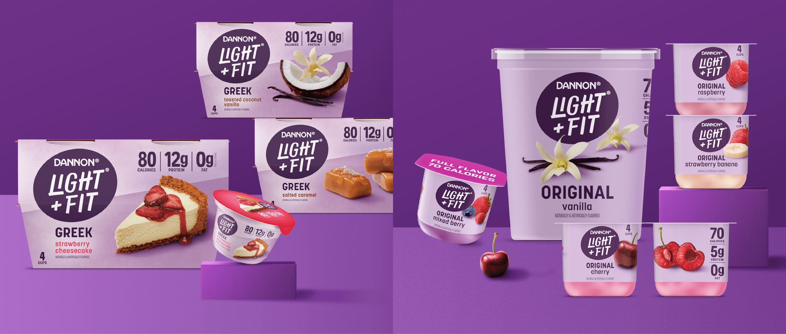
Light + Fit,
portfolio extension
From idea to shelf: I was brought in to take a strong creative direction and turn it into a working system on shelf. The idea had a clear point of view, but needed to be flushed out and built into something flexible enough to work across a much larger portfolio. I developed the visual language and brought the idea to life across the brand.
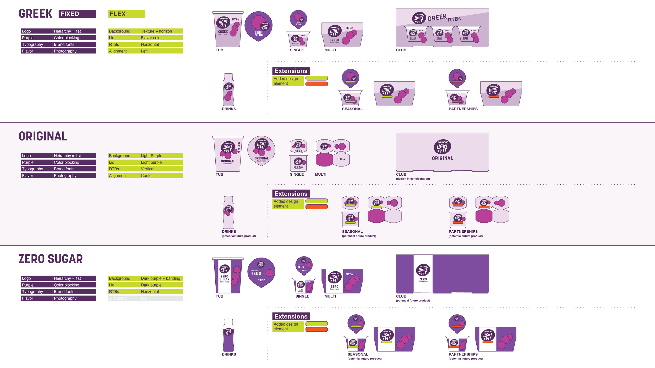
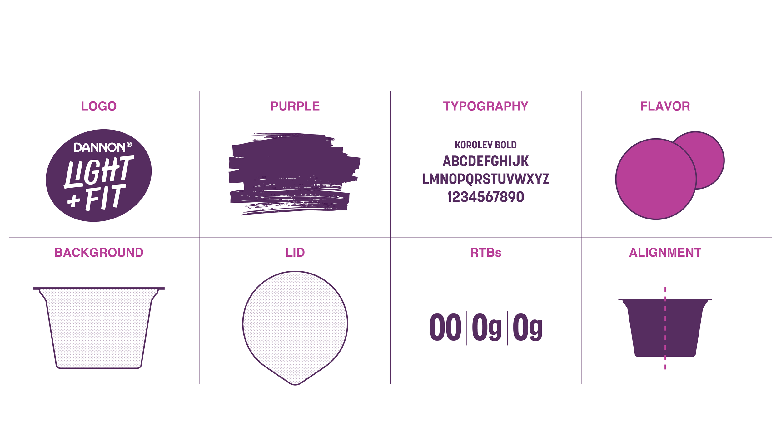
BRAND SCHEMATIC
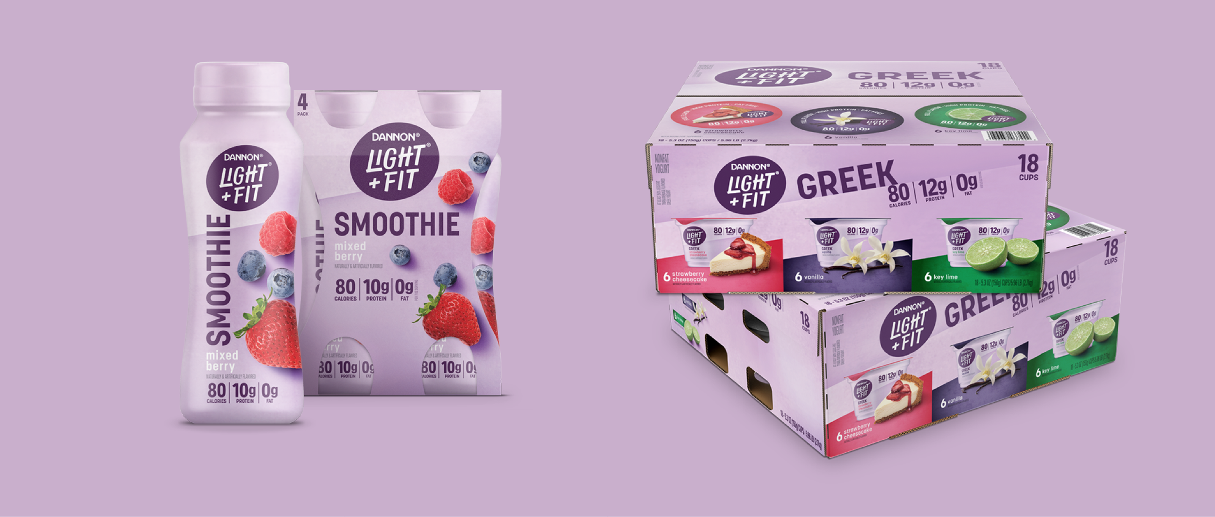
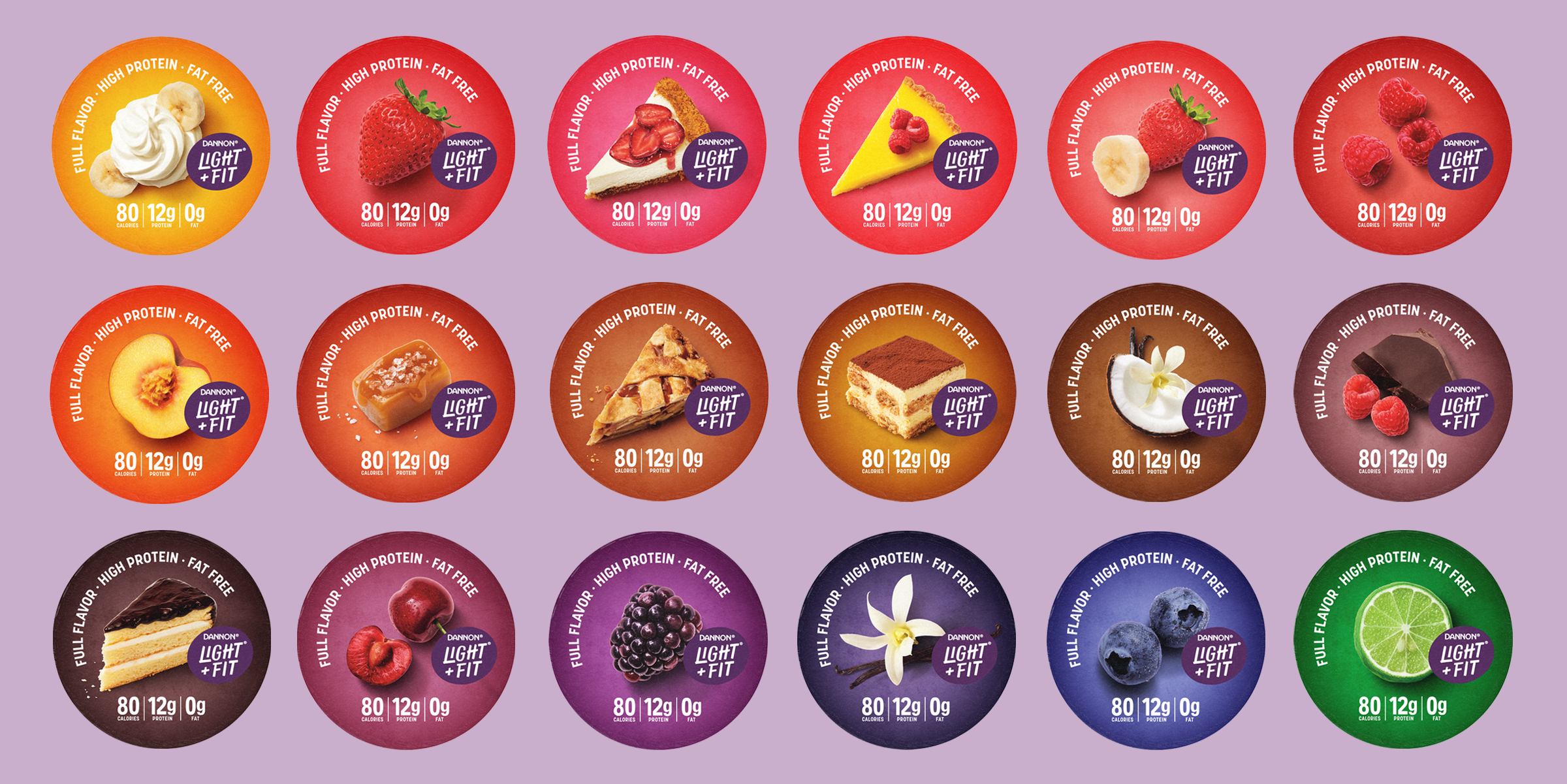
This was a massive undertaking, spanning more than 50 SKUs across Greek yogurt, Original yogurts, club packs, smoothies, and future seasonal offerings. I developed the portfolio architecture and established the visual rules that kept everything connected while giving each product room to stand apart.
EXECUTION
I had some amazing creative assets to work with. My job was figuring out how to make all those pieces work together, defining the hierarchy, color, imagery, and graphic elements that made Light + Fit distinctive. The result was a cohesive system built to grow with the brand.